


Editable SVG Icon Systems
Base Example
There are many ways to create an SVG Icon System, but one method that takes advantage of Vue’s capabilities is to create editable inline icons as components. Some of the advantages of this way of working is:
- They are easy to edit on the fly
- They are animatable
- You can use standard props and defaults to keep them to a typical size or alter them if you need to
- They are inline, so no HTTP requests are necessary
- They can be made accessible dynamically
First, we’ll create a folder for all of the icons, and name them in a standardized fashion for easy retrieval:
components/icons/IconBox.vue
components/icons/IconCalendar.vue
components/icons/IconEnvelope.vue
Here’s an example repo to get you going, where you can see the entire setup: https://github.com/sdras/vue-sample-svg-icons/

We’ll create a base icon (IconBase.vue) component that uses a slot.
<template> |
You can use this base icon as is- the only thing you might need to update is the viewBox depending on the viewBox of your icons. In the base, we’re making the width, height, iconColor, and name of the icon props so that it can be dynamically updated with props. The name will be used for both the <title> content and its id for accessibility.
Our script will look like this, we’ll have some defaults so that our icon will be rendered consistently unless we state otherwise:
export default { |
The currentColor property that’s the default on the fill will make the icon inherit the color of whatever text surrounds it. We could also pass in a different color as a prop if we wish.
We can use it like so, with the only contents of IconWrite.vue containing the paths inside the icon:
<icon-base icon-name="write"><icon-write /></icon-base> |
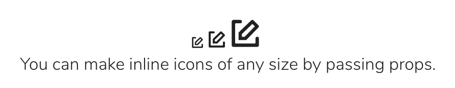
Now, if we’d like to make many sizes for the icon, we can do so very easily:
<p> |
Animatable Icons
Keeping icons in components comes in very handy when you’d like to animate them, especially on an interaction. Inline SVGs have the highest support for interaction of any method. Here’s a very basic example of an icon that’s animated on click:
<template> |
import { TweenMax, Sine } from 'gsap' |
We’re applying refs to the groups of paths we need to move, and as both sides of the scissors have to move in tandem, we’ll create a function we can reuse where we’ll pass in the refs. The use of GreenSock helps resolve animation support and transform-origin issues across browser.
See the Pen Editable SVG Icon System: Animated icon by Vue (@Vue) on CodePen.
Pretty easily accomplished! And easy to update on the fly.
You can see more animated examples in the repo here
Additional Notes
Designers may change their minds. Product requirements change. Keeping the logic for the entire icon system in one base component means you can quickly update all of your icons and have it propagate through the whole system. Even with the use of an icon loader, some situations require you to recreate or edit every SVG to make global changes. This method can save you that time and pain.
When To Avoid This Pattern
This type of SVG icon system is really useful when you have a number of icons that are used in different ways throughout your site. If you’re repeating the same icon many times on one page (e.g. a giant table a delete icon in each row), it might make more sense to have all of the sprites compiled into a sprite sheet and use <use> tags to load them.
Alternative Patterns
Other tooling to help manage SVG icons includes:
These tools bundle SVGs at compile time, but make them a little harder to edit during runtime, because <use> tags can have strange cross-browser issues when doing anything more complex. They also leave you with two nested viewBox properties and thus two coordinate systems. This makes the implementation a little more complex.